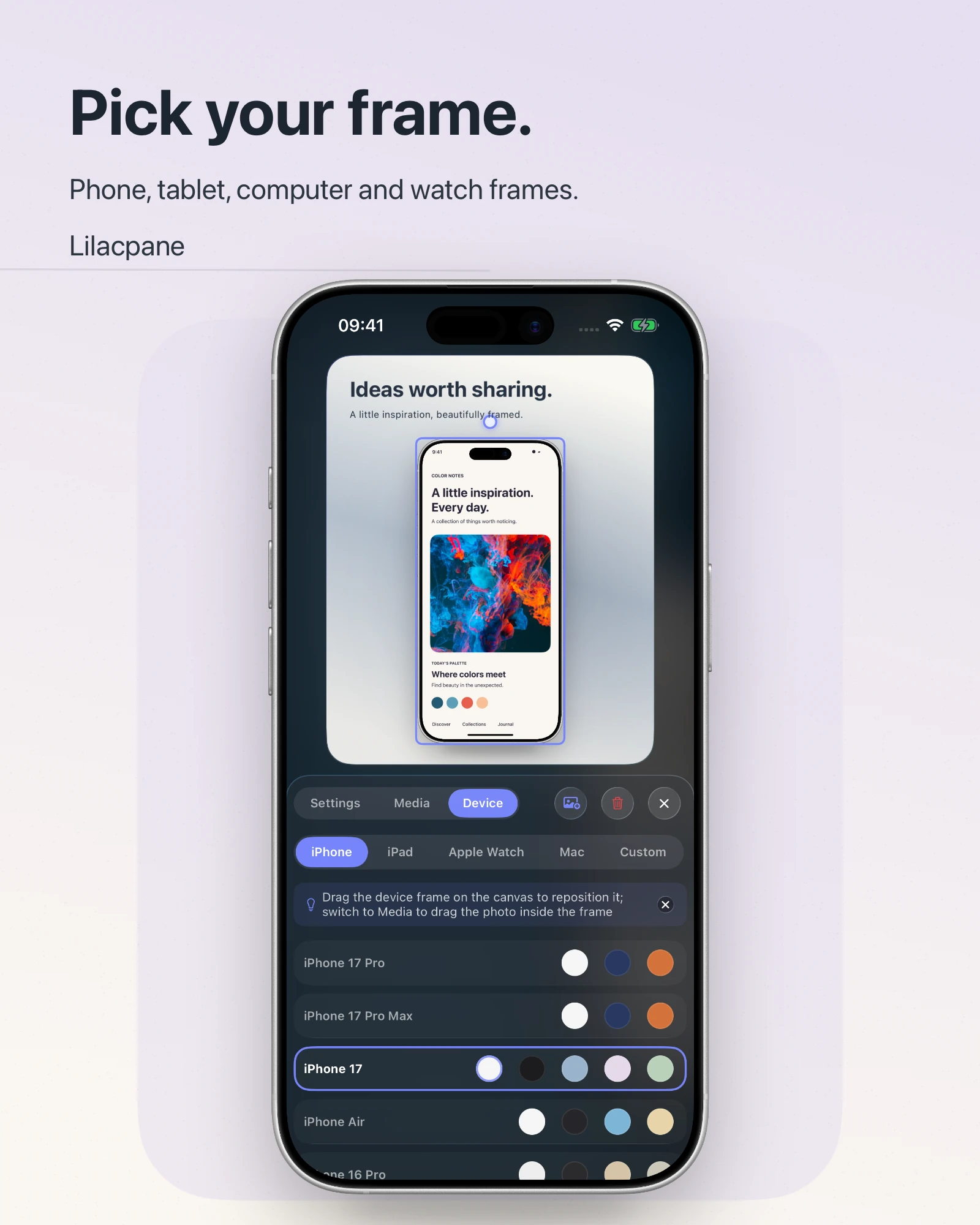
 Lilacpane
Find the first stage where the detail changes
A sharp device frame with unreadable buttons, an image that looks fine in Photos but soft on a website, and a larger export that fails to improve text are different problems. Keep three references: the source screenshot, the direct export, and the published page. Compare them in order: source, composition, export, and display.
Choose one detail, such as a line of body text or a thin icon, and compare that same detail at each stage. Review near the intended display size where possible. Enlarging a screenshot of a tiny preview introduces another scaling step and does not show the quality of the actual exported file.
Layer 1: check the source screenshot
Open the original. If its small text is already unclear, capture the interface again before adding a frame. Prefer a direct system screenshot over a chat preview, website thumbnail, or an image that has already been framed and exported.
Apple documents the capture controls for different iPhone button arrangements in its iPhone screenshot guide. Inspect the saved source before editing. When someone else supplies an image, compare its received pixel dimensions with the original dimensions they report.
A filename containing “HD” or “original” does not establish resolution. File size alone is not enough either. A large background can produce a large file while the interface inside it remains small. Keep the clean screenshot alongside the finished composition so you can trace later problems back to the source.
Layer 2: calculate the screen's share of the canvas
The full canvas dimensions are not the dimensions available to the interface. Consider a planning example: the canvas is 1200 pixels wide, and the visible device screen occupies 35% of that width. The screen content gets about 420 pixels across. Even a much larger source must fit into that space.
If the frame is sharp but the interface is too small, enlarge the main device, reduce decorative space, or create a separate close-up. A three-device composition cannot always make every line of interface text readable in a small mobile feed. Use surrounding copy or a detail image to explain the important action.
| Symptom | Check first | Try next |
|---|---|---|
| Sharp frame, tiny interface | Screen area within the canvas | Enlarge the main device or add a close-up |
| Only the imported screen is soft | Source quality and media scaling | Replace with the original capture |
| Headline, frame, and screen are all soft | Actual exported pixel dimensions | Compare export settings with the file |
| Sharp locally, soft online | The image resource loaded by the page | Check thumbnails, compression, and display width |
Layer 3: inspect the exported file
Make one test export in Lilacpane. Inspect its actual width and height, then compare the headline, device outline, and screen details. Available export formats and scales depend on the current version. A label such as “high quality” is not a substitute for the dimensions required by your destination.
On a Mac, Preview provides width, height, proportional scaling, and resampling controls in Adjust Size. See Apple's Preview sizing guide. Changing print-resolution metadata is different from adding image pixels. Editing a DPI number cannot restore letter detail that is already missing.
For an App Store submission, separately verify the required size category and file format. A visually sharp image still needs to meet the destination's specifications. See the App Store screenshot size guide for that part of the workflow.
Layer 4: check what the website actually displays
Websites can serve different resources for different layouts and device pixel densities. Google's web.dev guide explains responsive image selection.
As a planning example, an image displayed at 600 CSS pixels wide on a screen with a pixel ratio of 2 can start with a roughly 1200-pixel-wide resource. This is an example calculation, not a universal export requirement. File weight, compression quality, and the real layout still matter.
If the uploaded file looks sharp when opened directly but soft inside the page, ask the website maintainer to check the loaded thumbnail, image-service compression, mobile resource selection, and whether CSS is enlarging a small image. Rebuilding the mockup repeatedly will not isolate a problem introduced at this stage.
Keep a short test record
Record the source dimensions, export dimensions, display width, and observed problem. Change one variable first, such as the device's share of the canvas, and compare the same line of text again. Once the result works, apply the chosen layout and export settings to the rest of the set.
Will a larger export always look clearer?
It can provide more pixels for the composition, but it cannot recover missing source detail or fix a device that is too small in the layout.
Why is the frame sharp while the screenshot is blurry?
They come from different source assets. Inspect the imported screenshot and its scaling within the composition.
Do I need to test the website if the file looks fine locally?
Yes. The website may load another size or compressed version. Check both the mobile and desktop layouts.
Official references