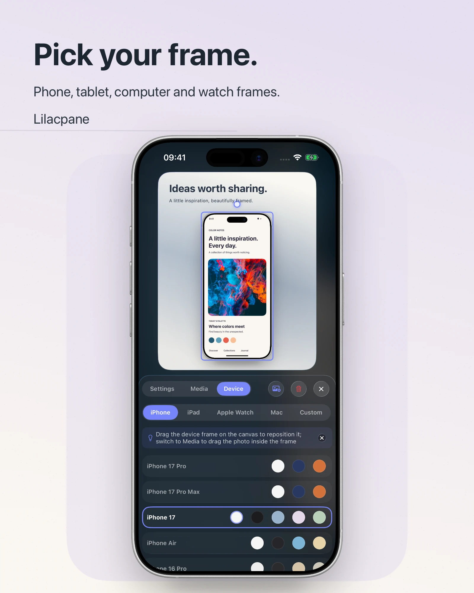
 Lilacpane
01 / Give each placement a distinct job
| Placement | User question | Visual direction |
|---|---|---|
| Hero | What is this? | One strong subject showing a representative screen or result |
| Feature | What can it do? | A closer crop or a clear outcome |
| Workflow | How does it work? | Ordered step visuals |
| Guide | Where do I click? | Accurate UI with minimal decoration |
02 / Keep one visual focus in the hero
A hero device visual should communicate product form in seconds. Several devices, deep shadows, a video, and long copy all compete. Give the primary device and headline a clear relationship and preserve room for the download action.
- Use a simple left-right or vertical relationship between copy and device
- Reserve visual space for the main action
- On mobile, preserve the complete product view instead of using a dramatic crop
03 / Make feature visuals accurate before impressive
A frame can establish context, but the important interface area still needs to be large enough to understand. If a full phone becomes tiny inside a card, use a close crop or split the explanation into two visuals.
04 / Treat file weight as part of the design
Prefer modern image formats, declare width and height, lazy-load below-the-fold media, provide a video poster, and avoid autoplaying duplicate videos on mobile. Visual polish should not cost the visitor unnecessary data and waiting time.
FAQ
Should the hero use a video or an image?
Use video only when motion is essential to understanding the product. If a static result communicates the value, an image is usually faster and calmer.
How many device images should a page contain?
There is no fixed count. Add one only when it answers a new question instead of repeating the same screen for decoration.
How should alt text describe a device visual?
Describe the interface, device context, and meaningful result in the image. Avoid repeating a list of keywords.